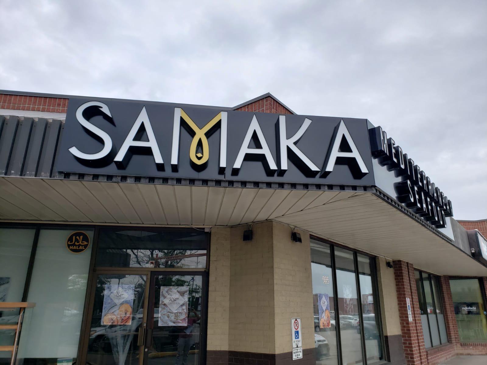
A restaurant’s success depends heavily on the quality of its sign and logo. Sign and logo must promote your business. No amount of effort will pay off if you don’t promote your restaurant in right style to the right people. Among many ways to promote your product/service, digital signage is one of the most successful ways to promote your restaurant. Being the best sign shop in Mississauga, ‘VIP Signs’ offers you affordable, custom, and unique solution. Unfortunately, many restaurants overlook the benefits of signage.
First impression always counts. Imagine why bigger brands still invest in modern signs despite the fact that they have a stable clientele. Thanks to the breathtaking and dazzling signs made and installed by the best sign shop in Mississauga, you can easily attract new customers. Customers feel attached to an establishment when they see a cool and eye-catching logo/sign.
An eye-catching and effective restaurant sign made and installed by a sign shop in GTA need not to be expensive. Compared to other forms (digital media/TV advertisement/newspaper/radio), digital signs can attract a diverse clientele. Readability, accessibility, colorful, an appealing logo, and a strong CTA are the defining characteristics of a top-notch restaurant sign.
The sign outside/inside of a restaurant is frequently the first impression that customers have of the establishment. Make sure your sign installed by the sign shop in GTA is easily readable and accessible by choosing a legible font-type.
A sign with a lot of caricature (different fonts/colors/angles) may look impressive to some, but it can be frustrating for other customers. It’s important to remember that people passing your storefront will only have a few seconds to see your restaurant sign. Make sure the restaurant signs shop in GTA understand this fact and design the right thing.
Learn the symbolic significance of colors and use them wisely. However, make sure to stay on topic and keep things somewhat structured. Select colors that will make the sign stand out. Colors like black, cherry red, deep brown, yellow work well as background colors. Light colors (baby pink, light blue, light gray, pale green) look better as background color if the text color is dark. Your restaurant signs shop in GTA will keep each aspect in consideration.
The images and logos you’ll display should be easily recognized and can be associated with your restaurant. You increase the likelihood that the maximum number of people will recognize your logo/sign by keeping things simple. It is very much important that your customers get positive and as much info as possible of your restaurant or diner space. Ask sign shop in Mississauga to design a signage that truly speaks of your business.
Modern signs include QR code in them for fast and easy navigation. Pedestrians and motorists can take advantage of a QR code displayed on a restaurant’s digital or physical sign. Besides offering them a digital menu, you can now let them know that the prices on your menu are in a range. Using a legible font, color, design, and size is all that is required. Always prefer hiring the best restaurant sign shop in Mississauga that understands your requirements, adheres to the budget, and delivers the unique sign.